In the interest of fair disclosure, we have no connection to it nor have we ever spoken with its proprietor. But it's a site in our humble opinion often worth the read.
There's no such thing as a perfect indicator. As noted below this one flashed an early bullish signal months too early in 2008. So as always continue doing your homework.
Equity Returns and the Yield Curve
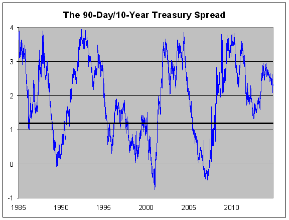
I did some research and found this fascinating stat. When the spread between the 90-day and 10-year Treasury yield is 121 basis points or more, the stock market does much better than when it’s 120 basis points or less.
Here’s how it works. Since 1962, the S&P 500 has averaged a 1.42% annualized gain when the yield spread is 120 points or less (that doesn’t include dividends). But it’s averaged 10.47% per year when the spread is 121 basis points or more. That’s a big difference.Over the last 53 years, the spread has been 120 basis points or less about 41% of the time, and it’s been 121 basis points or more the other 59% of the time.
The spread has been over 121 points continuously for nearly seven straight years. In fact, the indicator’s only big miss came in early 2008 when it flashed bullish several months too early.
The yield spread is currently 230 basis points. If the 10-year yield stays at this level, then, according to our indicator, we don’t have to start worrying about stocks until the 90-day yield gets over 1%. It’s currently at 0.04%.
Here’s the spread over the last 30 years (the black line is at 120 basis points):
No comments:
Post a Comment